


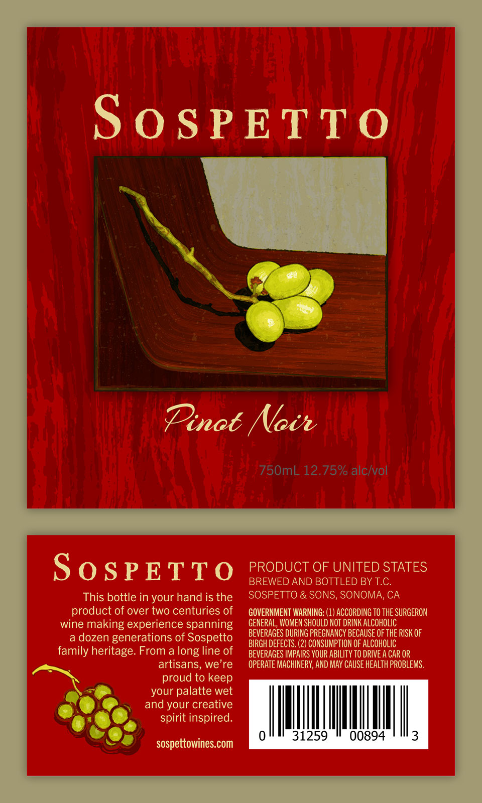
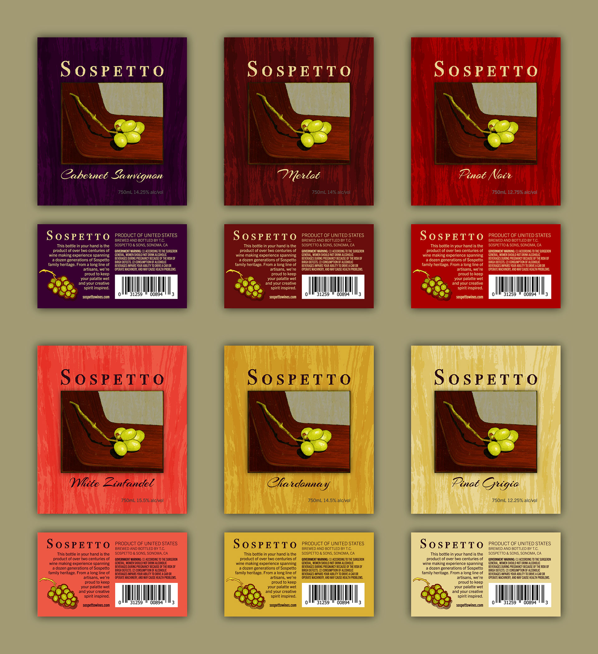
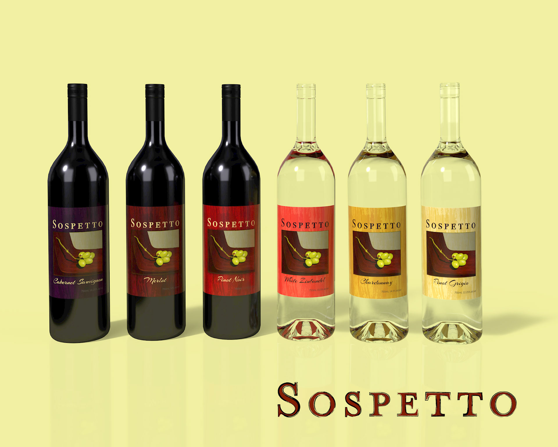
Sospetto is “created for creatives”. The alluring, artistically expressive aesthetic is designed with that specific target audience in mind. Sospetto aims to appeal to creatives, all along the spectrum of involvement, from casual to professional; all walks of life with the common threads of individuality and the desire to contribute to the artistic landscape. Sospetto is Italian for suspect. That initiative is to allow the consumer opportunity to paint a thin coat of bad behavior onto an otherwise well-behaved and responsible lifestyle; such is the nature of wine drinking. “Suspect” also lends anthropomorphic personification to this product, providing it identity among the common fare of art supplies which are customary in the artist’s tool kit.
Sospetto, to the finer things in life.
Name: Sarah P.
Age: 29
Occupation: Waitress
Archetype: Caregiver
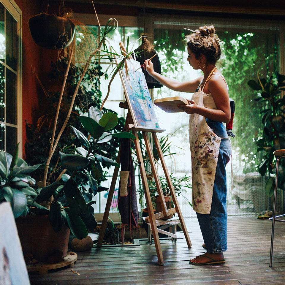
Sarah is a waitress, but don’t tell her that. If you engage her in conversation, and ask what she does, she’ll be eager to describe her artistic deployments. Because Sarah’s paying job keeps her occupied mostly nights and weekends, her creative productivity takes place over weekdays, or late at night, when most of the rest of the population is sleeping or toiling at their day jobs. These times are quiet, reflective, and serene. That serendipity Sarah gets to experience often makes her question whether her personality shaped her lifestyle, or if her circumstances produced her traits. Either way, she is satisfied to keep company among nature and her artwork, and enjoy human interaction somewhat less than others whom are more extroverted. As is the case with most introverts though, she often pines for a more interpersonal existence, residing beyond the confines of her own imagination. This self-imposed inclination to “try and loosen up” has rendered her a regular consumer of wine, for its socially warming effect. In addition to wine’s physical properties, Sarah admires that its consumption is in character with the Bohemian image that she likes to project. Notable is that just as with her favorite Filbert brush, and her Windsor & Newton Yellow Ochre, Sarah is the type to find the one wine she likes and stick with it, rather than explore a variety of brands.
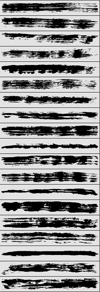
Proprietary Brushes Collection
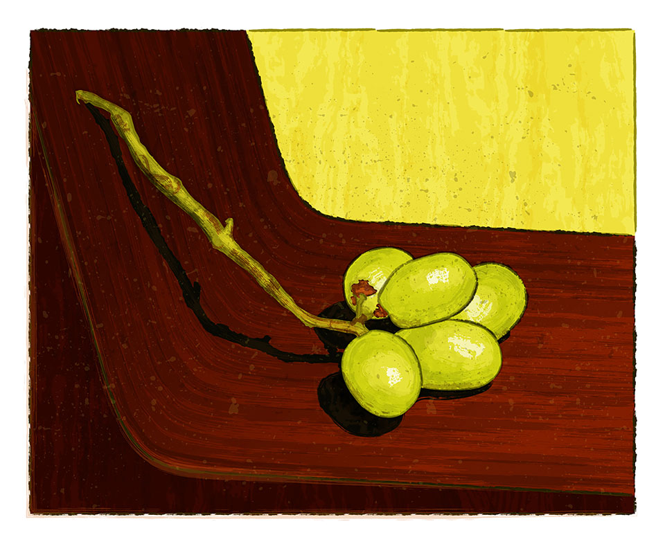
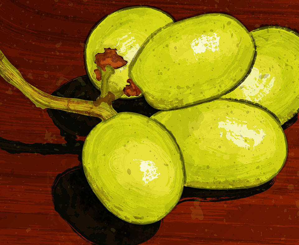
In order to produce the aesthetic shown, I worked from analog brush strokes; good old-fashioned paint, painted onto a surface with a paint brush. Whence I had a satisfying variety of brush stroke patterns applied, I photographed them and isolated them in Photoshop. From Photoshop, the black & white images were brought into Illustrator where they were converted into vector artwork. As vector art, the brush stroke patterns were saved as digital brushes. I made several, to constitute the brush library, shown here, that was utilized for all of the artwork in this project. What I find rewarding about this process, is that it is entirely proprietary; not relying on any of the out-of-the-box brushes that ship with Illustrator.